Thursday, 20 February 2014

Evaluation

The two media products that we made for our campaign are a short documentary and three posters about our campaign, regener8. Although the two media forms cover different topics and have different messages, we have made it clear that the two products are linked by creating visual continuity between each of our products. We have created a house scheme using the colours green, black and white in each of the posters and trying to use these as much as possible at convenient points during the video. We have also used the same typography as in our logo for all the text on each of the posters and throughout the video, and there is also the use of our logo and slogan, central in each of our posters and shown for a long period at the end of our video. The methods of contacting us at the bottom of the poster/ end of the video are also the same links (we have focused on the same websites). There is also a subtle similarity in that we have used images of the same teenagers on our posters whom are in our video, which not only creates another link but could help create a corporate identity/ face for our campaign. There are also further links between the three posters, for which we have used the same idea and template. The visual continuity between the three posters and the documentary make it clear to the audience that these media forms are all linked and belong to our campaign, making it look authentic, genuine and professional.

When we were first given the brief, we were informed we needed to 'encourage them to participate in the renewal or protection of this local space' drawing on our 'local knowledge and your media expertise'. We researched two areas in order to successfully understand the brief and create a campaign- the media and conventions, methods and techniques used in campaigns, focusing on local projects such as 'Wild Stevenage' and 'Baldock Needs a Skate Park'. We then researched regeneration, focusing on the impact it had on community so we understood the information we would include in our campaign. This enabled us to meet the needs of the client by creating a successful campaign using effective methods and techniques with information relevant to what they believed in and wanted to educate people about.

We looked at the codes and conventions of campaigns during our research section and tried to apply this to our own work. For example, we created a logo, slogan and company name specifically attracting the target audience. We included various methods to contact us (we chose Facebook and Twitter, which lots of campaigns use as they are the two most popular social networking sites). We used techniques such as direct address, statistics and rhetorical questions to accompany the images on our poster (similarly to our video, with clear caption and popular, current background music).

We have tried to make this campaign as specific to teenagers as possible, considering the stereotypical teenager at each stage of brainstorming ideas and designs. Our campaign name, 'regener8' and slogan 'it's up 2 u', use text talk which is used or understood by most teenagers and is slang particular to that age group. We have used images of teenagers in each of our posters to attract them and show how they are impacted by regeneration. Similarly in our documentary we have interviewed a variety of teenagers appealing to all 'cliques' and even included a section dedicated to teenagers to get their attention and encourage them. We also considered teenagers when selecting the music music in the documentary, generally using young artists with popular songs in the 'indie' genre, voted most popular by teenagers in a recent online poll.

Throughout the campaign we have tried to represent the stereotypical teenager, whom the target audience can relate to, making the issue seem more important because it has an impact on them and they cannot ignore it. We have used teenagers in the documentary and shown them as the kind of person they would expect to see by dressing them in casual clothes, generally jeans and a t-shirt to make them seem approachable and not above the audience, adding to the impact of the message (how it affects everyone). We have shown flashbacks of the teenagers doing typical activities e.g. going to the park or playing on their phone. The language they speak in is not unprofessional but still casual and how a typical teenager would speak.

When we were producing our products, we created two production schedules- one for the documentary and one for images to use on our poster. We ensured the schedules did not overlap so we had plenty of time to focus on both products. We made sure to stick to this schedule so we could meet deadlines. We tried to film the material as close together as possible because we wanted to focus on editing the footage.

We tried to make our campaign as appropriate as possible and did not include any text, dialogue or images that could be seen as rude or offensive. We did not include references to any products, companies, people or other campaigns to avoid being disrespectful. We took these precautions to oblige with any existing rules or regulations regarding campaigns.

The products were created as a team. We both came up with separate first drafts and ideas that we then looked at and combined so that we both had an equal say and ideas. We did the same whilst creating scripts for the documentary and arranged to film separate parts of the documentary to save time, and then edited them together. We both created separate sets of posters, although we used some similar techniques and ideas so that we both contributed equally to the campaign overall.

To improve, there were a few technical issues we would have liked to fixed had we the time, for example the sound quality in the video wasn't good because of the weather conditions and the edges of some of the images we used were slightly pixelated which doesn't make the campaign look very professional. We would have liked to have shown a wider variety of teenagers, especially in our posters where the images are all of females which could suggest our campaign is biased towards girls or they are the only sex who would benefit from our ideas which is not the message we want to send. The second section of our documentary, 'Why is regeneration important?' also includes some jargon, such as brownfield and greenfield sites- we should have elaborated and included definitions to make it more easier to understand for the target audience.

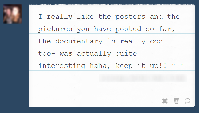
I think our representation of teenagers and the materials/ techniques we used to attract them were successful- we received positive feedback through social networking from lots of teenagers. We also like our final idea for the poster, using a smartphone to capture what the future looks like- we like how it links in with the corporate image of the campaign and is creative. We are also really happy with the final documentary as it runs smoothly.


This is some of the feedback we received through Facebook, Twitter, Tumblr and YouTube


Thursday, 13 February 2014

Final Products

Posters: 


Documentary: 


Scenes From Documentary

These are the final cuts of each of the four scenes we filmed.

1) What is regeneration/ why is regeneration so important?


We have started off the documentary by explaining what regeneration is so that teenagers understand exactly what the aim of the campaign is- a lot of teenagers may be unaware of the issue. We have scripted it in relatively simple terms and tried to avoid using jargon so the target audience don't find it too boring and understand exactly what is being said. A teenager is also speaking, showing how the information is relevant to teenagers and make them feel as if they are being spoken to by someone at their own level. It is set in a typical teenage bedroom to make it feel as genuine as possible. We then ask a second question 'Why is regeneration so important?'. Although a lot of this information would come under the first question we wanted to highlight the importance of regeneration to the target audience.

The songs playing are Midnight City and Outro by M83. These are both catchy songs often heard on TV or the radio that teenagers should recognise, encouraging them to listen and maybe associating the song with the campaign.

2) How does regeneration affect community?


This section of the documentary shows how a community benefits from the regeneration of an area. We wanted to include this to show that if Buffs Field were to be regenerated, it would have a positive impact on their social lives. We have given an example- the regeneration of Avenue Park, something a lot of local teenagers will remember but not fully understand as it is not a facility they use. If they see how children enjoy the park they may want a similar project at Buffs Field. Again, the language used is incredibly simple and should be understood by the target audience. We have a teenager presenting for the same reasons as before however this time she is dressed in an opposite style of clothing and should therefore attract a different 'clique' of teenagers. We are trying to show that no matter what style and interests, regeneration would affect everybody.

The song playing is Best Day of My Life by American Authors, because the lyrics are very positive, reflecting the mood of this section.

3) Why do teenagers need space?


This is the longest section of our documentary because it is the section that speaks to the target audience directly. It should show that we understand their needs, and talking about issues that they are aware of and could possibly affect them, e.g. mental and physical health, internet and television addiction and youth crime. We then aim to show how these issues link in with community areas and regeneration. This should hopefully make the audience more interested and enthusiastic about the idea it would not only benefit the community as a whole but teenagers specifically. Although it was not in our storyboard, we also added an anecdote in this section describing how teenagers used to come to Buffs Field and how important it was to the teenage community. This makes the topic more relatable and could also be viewed as emotional. This adds to the effect it has on the target audience specifically (the anecdote uses a teenager). It is again presented by a teenager. 

There are two videos for this section; the first is our final idea however the second the draft that we showed in our second presentation. We decided to re film it as the video was shaking and the sound quality was bad in comparison with the other videos we had.  

The song playing is Wings by Birdy as it was slower, in a minor (sadder) key and fit in with the flashback, which was a lot more negative than our first two scenes. 

4) What is regener8? 


The final section of our video is talking about our campaign. We briefly outline what the campaign is, what it stands for,what we want to do and how teenagers could help. We have made it clear to the audience that it is aimed at teenagers and used persuasive techniques such as direct address, emotional language and the rule of three (telling them what we want to do to Buffs Field). This is hopefully effective in gaining support. Whereas all the other sections are presented by females, in this section we have a teenage boy speaking about the work to show that the work is not biased towards a particular sex; we want the help of boys and girls and the work we are doing should appeal to both of them. We have tried to make this section as enthusiastic and positive as possible, ending with some more flashbacks of teenagers playing on the field to make people want a place like that locally and make them want to get involved. 

The song playing is Don't You (Forget About Me) by Simple Minds, a song lots of teenagers will recognise from the famous teen film 'The Breakfast Club'. We chose this song because not only will teenagers have heard of it but it is positive and ends the documentary on a positive note. 

Wednesday, 5 February 2014

Second Presentation with Feedback


Class feedback: 

"Good ideas."

"Was very good."

"Nice PowerPoint"

"I found their video very effective, it made people want to watch."

"Good poster design, fabulous ideas."

"Very good presentation."

"Good understanding of target audience and clear voices from both.."

"Good presentation  and a good presentation style."

"Smartphone Logo linked in with target audience well. Good use of stats. Logo and Poster good. Video good."

"Clear presentation with good ideas and great end products. Spoke clearly and explained everything with good points"

"Good film understood it."

"Presented well, both spoke loudly and clearly. Answered all questions within the presentation and covered all areas of progress. Great logo and poster ideas, e.g. smartphone attracts target audience. Great use of statistics and conventions. Links back to the brief."

"The posters are all the same which is plain and could do with different types of posters and not reading off a script"

"Have more people in your video"

"Video sound could if been better and a bit too much writing"

"It was okay but think Polly spoke a little to fast to understand what she was saying sometimes and they went through the slides quite quick."

"Maybe Polly could slow down when talking"

"Could speak clearer."

"Couldn't hear what was being said in their film."

"They need to cut out the interference with the microphone."

"To improve, it was a bit difficult to hear the documentary"

"Couldn't see some of the writing. Couldn't really hear the film because of the wind and cars"

This is the PowerPoint that we used and the video that we showed.. 


Second Presentation from jessfareymedia

This is a link to the video on YouTube


Thursday, 16 January 2014

Poster- first ideas

This is the draft for each of the posters we intend to create, with annotations as to why we made each decision and how it should be effective in attracting the target audience. 


I then created the following poster based on the template, using our own images and text. 


I am pleased with how the first draft has turned out- the statistic from our survey grabs the attention of the target audience and gets them thinking if they are satisfied with where they live, and makes it clear this issue is relevant to teenagers. This shows we have an insight as to what they think and that we understand their needs. 

The background shows a black and white photographs of Buffs Field in its current state- messy, muddy and empty. We chose a black and white background because it has connotations of being boring, dull and draining, adding to the message we want to give. It also has an aesthetic impact, drawing attention to the more important coloured image in the middle. This is an image of a football pitch in a good condition and being used by teenagers, showing the potential Buffs Field has to become a popular teenage hangout and highlighting its current neglected state. People may be more enthusiastic and want the area to be regenerated once they have seen what it could become. 

The coloured image is enclosed in an image of a smartphone, a modern piece of technology- the connotations could even go as far as futuristic, linking in with the  idea of what the field could look like in the future. The smartphone is effective in targeting teenagers because stereotypically they are the best and most obsessed with having the latest and 'coolest' technology. This links in with our campaign name and slogan, which consists of modern text talk. 

Finally, we have included a QR code, a direct chance for the audience to interact with us. Although we have also included links (to Facebook and Twitter, the two most popular social networking websites), the QR code is more unique and unusual to access, perhaps making our poster more memorable. Most teenagers own a smartphone or smart device that can read QR codes. 

I aim to make three posters of a similar layout and using the same techniques but with different images and statements. I will try and edit the images to get rid of the blurry edges so the campaign looks more professional. 

Wednesday, 15 January 2014

Images for our campaign

These are a selection of images that we have taken locally to use in our campaign, mainly around Buffs Field, the focus of our campaign. We intend to use these on our posters and feel they are relevant as they highlight how bad a state the field is in and why it needs regenerating. There are also some of teenagers in this area we could use to attract the target audience specifically.  


Monday, 18 November 2013

Social Networking Links

We have set up a Facebook, Tumblr and Twitter page for regener8, which we will update regularly with our ideas in order to get feedback from the target audience as we continue to plan the campaign. This will make the campaign as appealing to teenagers as possible so we can understand what they like and what we could improve on. We have promoted the page through our own Facebook accounts specifically to teenagers so that whatever feedback we may receive will help us with the campaign as teenagers and adults will obviously have different views/ ides.


Facebook: https://www.facebook.com/regener8campaign


Twitter: https://twitter.com/regener8campgn 


Website: https://regener8campaign.weebly.com  


Tumblr: http://regner8-campaign.com 

Scripts

What is regeneration?
Regeneration is developing an existing area and turning it into something that will benefit the community. It can affect an area positively socially, economically, environmentally and aesthetically. 

Why is regeneration important? 
Regeneration is important because it uses Brownfield sites which mean that Greenfield sites in the country are preserved, which is better for the wildlife. Fewer materials are needed as you can reuse old ones and it means that the facility is in a densely populated area and will be used by more people. 

How does regeneration affect community? 
The regeneration of Avenue Park in 2012 shows how regenerating an area can have a positive impact. The children are now happier and have somewhere to go. This is Avenue Park. A few years ago it was in a similar state to Buffs Field; neglected and dismal. Now with the new equipment it attracts more children and is so much more fun. A similar project should happen at Buffs Field, with apparatus designed for teenagers such as a skate park. 

Why do teenagers need space? 
I enjoy having somewhere with my friends where I can meet up and relax, however there aren’t many places where you can do this locally. In my opinion, having a community area is one of the most important things in a town. It gives people somewhere to go and they have plenty to do in their free time, such as socialise, start clubs or hobbies and play sports. This field is an example of somewhere where lots of people could come together and play sports- Baldock FC used it for training. It offered a chance for people to get fit which is not something teenagers are generally enthusiastic about. They would rather stay indoors watching TV or on the internet. This is bad for both their physical and mental health- it damages their creativity. Community areas also encourage people to meet and chat with new people. This can be done through groups or clubs. Baldock community centre offers dance classes, fitness groups and language classes, things proven to help people feel better about themselves. In places where there are no community areas there is less for people to do and not as many opportunities for people to socialise. These areas tend to have higher crime rates, especially in young people. 

What is regener8? 
Regener8 is a local campaign created by and for teenagers. We want to make Baldock a place where teenagers can be happy. We think the way forward is to restore Buffs Field in Baldock to its former glory. This could be done by building a small skate park, refurbishing the old building and doing up the football pitch. To do this we need the support of teenagers from not only Baldock but the surrounding areas to to raise awareness of the issue and get our ideas in the public eye. 

Filming Schedule


Date

Time Schedule


Location


Scenes


Costumes


Props


Equipment
8/12/13
12.00-1.30
Buffs Field
Georgia Interview about teenagers and flashback
Casual clothes, typically what a teenager would wear
Football and iPhone
Script, camera, tripod
12/01/14
12:00-1:30
Teenage
Bedroom
What is Regeneration?
Casual clothing- leggings and t-shirt
 None
Script, camera, tripod
12/01/14
03:00-04:00
Avenue Park
What is regeneration? (Example)
Same as above
 None
 Script, camera, tripod
19/01/14
10:00-11:00
Teenage Bedroom
How does regeneration affect community?
Dark clothing, typical style of older teenager.
 Script, camera, tripod
19/01/14
02:00- 03:00
Living room, TV playing
What could happen?
Same as above
 TV playing in background- research popular teen show, phone or tablet
Script, camera, tripod
25/01/14
2:00-
3:30
Buffs Field
What is regener8?
Jeans and t-shirt, very casual
None
Script, Camera, Tripod
25/01/14
4:00-5:00
Living room/ teenage bedroom
What is regener8?
Same as above
TV playing in background- research popular teen show, phone or tablet
Script, Camera, Tripod

Storyboard


Storyboard for documentary from jessfareymedia

This is the storyboard we have created for our documentary. It covers all the topics that we thought were relevant in our brainstorm of initial ideas. 

1) We will open with the question 'What is regeneration?' . This immediately will get the audience thinking about the topic and give them an idea of what we are campaigning for. We have chosen to use the same colours we used in our logo so that when we show it at the end there is visual continuity. The constant use of the colour green could also make the audience associate the colour with our campaign. The darker background helps the brighter text stand out. We plan to use the same font as in our logo throughout the video. 

2) We will have a teenager answering this question in simplified terms, without jargon so that the target audience will find it easy to follow. We think it is best to show a teenager as this means the target audience are more likely to relate to the person and want to listen- it shows the target audience how regeneration is relevant to them. We intend to film this in a typical teenage bedroom, adding to the authenticity and making it even more relevant and attractive for the target audience. 

3) We will then ask 'Why is regeneration important?'. Again we have used a rhetorical question to get the audience to think about the question and topic. We could have included this information under the first section, but asking this separately will highlight the positives of regeneration and draw attention to the fact that it is important. We will use the same colours and fonts for continuity and a professional look. 

4) We will cut back to the same teenager in the bedroom, expanding on the previous scene and briefly explaining why it is important, putting emphasis on the positive information. We chose to use the same teenager because both questions are incredibly similar and link in with each other. In both scenes the teenager will be dressed in casual clothes for example jeans and a t-shirt that is typical of the target audience. This should make viewers feel as though this is a realistic portrayal of someone their age and the regeneration is something teenagers should be aware of. 

5) We will now ask the target audience 'How does regeneration affect a community?'. We have highlighted the word 'community' in green as it is a key word in regeneration and something teenagers should understand. Changing the colour draws more attention to the word, which is why we have done it for a key word in every question, for example 'regeneration', 'community', 'teenagers' and 'regener8'. 

6) We want to give an example of regeneration to back up the points that we are making and intend to film a section about the regeneration of Avenue Park, somewhere local teenagers will recognise from when they were younger and should therefore interest them. This section will again be presented by a teenager to show that although the park is used by children, the concept could still have a positive impact on the teenage community. 

7) The next question will be 'Why do teenagers need space?'.  We have highlighted the word 'teenagers' to try and make this section as appealing to teenagers as possible and again emphasize why it is them in particular who need to understand regeneration and have a space of their own locally. 

8) We plan to film this scene in Buffs Field where we are campaigning to regenerate, and show what a bad state it is in and how regeneration could impact it. We will have a teenager talking about issues surrounding teenagers having nowhere to go that could shock them and they could possibly relate to. This section is very important because it is the most effective in getting the attention of our target audience in particular. 

9) Our final section is 'What is regener8?'. This will be the section where we talk about the campaign and try to make it sound as appealing as possible to them target audience and get their support. It uses the same colours and fonts for a professional look and visual continuity. 

10) We will then show another teenager speaking about the aims of the campaign and looking enthusiastic- they will be wearing, again, casual and stereotypical teenage clothes to make it look realistic and show how the campaign is aimed at teenagers. If the audience see this, it could encourage them to find out more. 

11) We will show the details of our campaign in the final slide- our name, logo and slogan, plus details how to get in contact with us. We have chosen to show this last so that it is the last thing that the audience see and is what sticks in their minds- it is important as these are the vital details. 

Final Campaign Name, Logo and Slogan

After brainstorming various names, logos and slogans for our campaign and evaluating the pros and cons of each, we decided on the name 'regener8'. This is the logo we created and intend to use in each of our media products. 
We chose this combination of words, images and colours because of the connotations they have and how effective they are in attracting the target audience specifically, for example the spelling of 'regener8' and 'it's up 2 u', stereotypical teenage text speak, which ties in with the use of the smartphone. We also used plainer colours to attract both sexes and the green highlights the change in spelling and has connotations of the environment and nature.

First Ideas: Logo, Campaign Name and Slogan

This is our first idea. The name of the campaign is 'regener8', and the slogan 'it's up 2 u'. I like this idea because I think that it will appeal to teenagers specifically the most out of our three ideas. It looks modern, professional and I think that it would attract both sexes. (Click to enlarge image)

Our next idea was 'FreeSpace'. The slogan that we created was 'Our Town. Your Space.' I think that this idea is also appealing to both sexes, and is very bright, which helps attract attention. I don't think that this idea is as good for specifically attracting the target audience.

Our final idea was the 'Anti #YOLO' campaign. This is a humourous and light-hearted take on the campaign that would definitely appeal to our target audience in particular- #YOLO is an acronym that is used on sites such as Twitter and Instagram and means 'You Only Live Once'. Not many adults or young children are familiar with this term, so it would attract the attention of teenagers straight away. The humour should make it more memorable. 

We think that overall, regener8 is the best campaign name, and is the one we plan to use. This is because is is interesting and unusual and although it attracts the target audience in particular, it is not too specific, and is understandable.